Jul 1, 2023
What’s the difference between an Icon and a Logo?

It happens all the time. An old friend or colleague will message me out of the blue and ask if I can make them an icon. “Of course!” I say, and as soon as we start working out the details, I realize they actually want a logo. It seems like a small semantic difference, but icons and logos are actually serve completely different functions. So I inform them that the cost of labor is actually much higher, much to their dismay.
Logos can vary in cost, but a good, high quality logo usually starts around $1000 and can go up to tens of thousands of dollars on big brands. But at the same time, you can subscribe to an entire high quality icon set containing 26,000 icons for about $100 a year. So what’s the difference, and why is there such a huge cost disparity?
For people who are not designers, the terms “icon” and “logo” may be confusing, and are often used interchangeably. But in the world of graphic design, they are completely different:
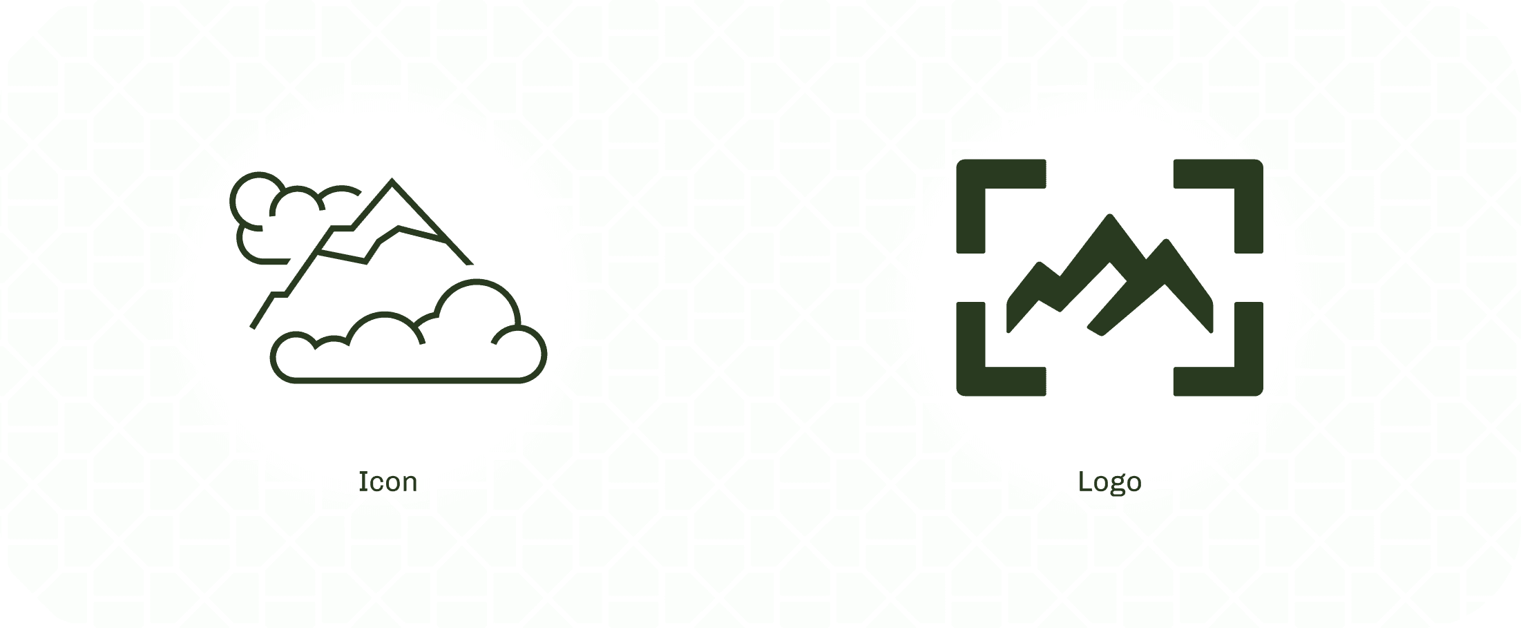
A logo is the visual identity of a brand, which can be for an individual, company, or organization.
An icon is a visual depiction of a thing or idea.
Let’s break this down by trying to answer the main question that you’re probably wondering…
Why are logos so expensive?
Why is it that a logo can cost thousands of dollars, whereas an icon is only a tiny fraction of that? It’s all because of the prominence of the image.
A lot of considerations need to be made for a logo that don’t need to be made for an individual icon, such as…
What are other logos that are in the same industry?
How do you make the logo different than others in the industry?
What is the personality of the brand?
What colors, shapes, styles, and visual metaphors evoke emotions that are similar to the personality of the brand?
Logo designers must consider all the ways a logo can stand out in a saturated market, and capture a brand’s heart and soul in a small image that is timeless, visually appealing, and unique. That’s time spent researching, iterating, sketching, brainstorming, and going through rounds of reviews with a client. That’s no easy task, which is why even just one logo can cost tens of thousands of dollars. It’s just way too expensive to get wrong (Gap anyone?).
Icons, on the other hand, should generally match the designs that exist in other brands, with just a few small tweaks that make it unique. That’s why “settings” is always a cog, or “edit” is always a pencil. That means that less time is required to research and iterate an individual icon asset. But don’t underestimate the need for a professional icon designer… that expertise is knowing how to make the icon feel like it fits in the library as a whole.
Compare and Contrast
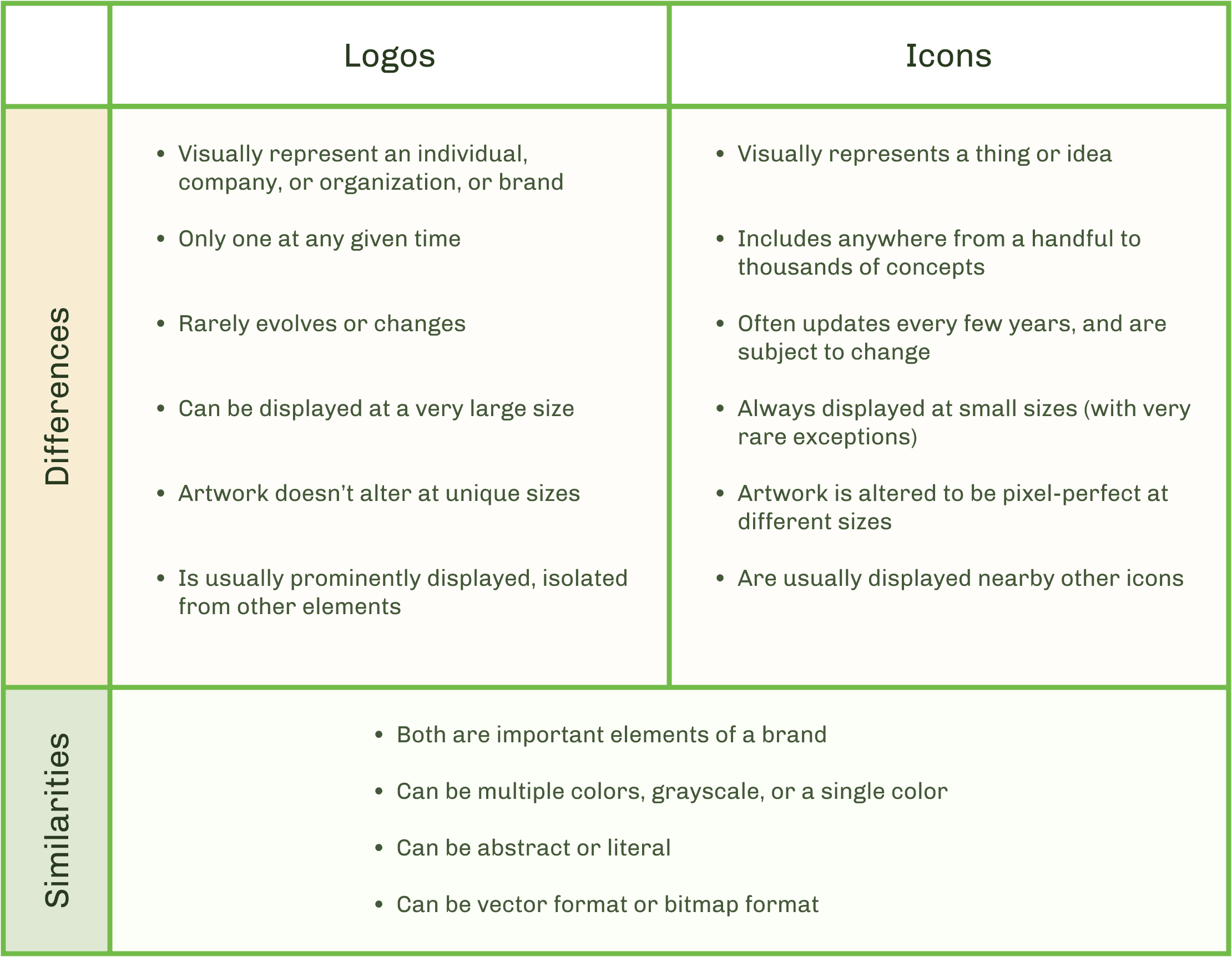
Here is a table that summarizes the key differences and similarities between logos and icons:

Logo differences:
Visually represent an individual, company, or organization, or brand
Only one at any given time
Rarely evolves or changes
Can be displayed at a very large size
Artwork doesn’t alter at unique sizes
Is usually prominently displayed, isolated from other elements
Icon differences:
Visually represents a thing or idea
Includes anywhere from a handful to thousands of concepts
Often updates every few years, and are subject to change
Always displayed at small sizes (with very rare exceptions)
Artwork is altered to be pixel-perfect at different sizes
Are usually displayed nearby other icons
Similarities:
Both are important elements of a brand
Can be multiple colors, grayscale, or a single color
Can be abstract or literal
Can be vector format or bitmap format
Just like Names and Bios
A good analogy to refer to when differentiating logos and icons is comparing them to a person’s name and their biography. Even though a name and a biography are made up of words, they have vastly different functions.
Logos and Names
Like a name, a logo never changes, except in very rare circumstances. Since a logo is the main visual identity, a brand will never have more than 1 logo at a given time. Logos may evolve, just as a person’s name may evolve (like if someone were to get married and change their last name, or go through a transition and adjust their first name) but by and large a name remains consistent for decades. Names are incredibly important because they are the key words that define a person or group. Logos are just as important, the only difference being that it is the visual depiction of the entity.
Icons and Biographies
Like a biography, a set of icons is always growing and evolving. Icons reflect the branding of an entity at that given time, but they aren’t set in stone, and may be added to many times over several years. And like a biography, an icon set can be any length. As a brand gains more experience and reputation, their biography will expand. Likewise, as a brand offers more services, features, information, navigation, etc., then the icon library will grow as well. A brand may have anywhere from a dozen icons to thousands in their library.
Conclusion
Logos and icons may seem similar, as they are both images drawn by designers. But their functions are vastly different: logos need to be unique and capture the personality of a brand, whereas an icon simply needs to be understood. This results in a drastic difference in time spent researching and iterating, resulting in a much higher cost for logos.
I hope this article was insightful for you! If you have any questions or want to learn more about a specific topic, email me at grifflecuyer@gmail.com.
Want to read more?
I like to write about icon design, so if you'd like to learn more about my craft and my process, check out my articles section. If you want to see more of my work, then click on one of my other case studies. If you're interested in working together, then contact me and we'll get started!
Case Studies
Comments
