Peerspace
Peerspace is an online marketplace that helps people find the perfect venue for business or personal use, whether it's for a meeting, production, event, or any reason they like. The design team had a great starting place for their icons, but needed an icon designer to review and extend their library.
Services
Production Icon Design
Team
Salve Retuta Pascual, Karissa Carter, Mackenzie Jones, Danielle Faugno-Teig
Dates
2024, April to June (3 months)
Website
TLDR;
In 3 months, I built over 1000 unique icon assets, distributed between 5 different sizes.
Why they brought me on
Peerspace reached out asking if I could help them bring their existing icon system across the finish line. They already established an icon style and created some preliminary guidelines, so they weren't starting from scratch. The team also had a head start on the more common core icons, but they needed an icon expert to refine the existing set and tackle the more complex concepts. Many of their icons also needed to be extended between 5 different sizes, which their existing team didn't have the resources to take on.

Genuinely a super awesome start! At least I didn't have to start from scratch.
The existing set
Peerspace's first set of icons were already in a great spot, but they needed some refinement. For one thing, most of them were very different in complexity. Some were very complex with the lines close together, and others were too simplified.
The first step for me was to organize the icons into categories, then move on to editing them individually.
When in doubt, categorize.
Categorizing a large set of icons has a lot of benefits. First, it keeps similarly themed icons nearby so that they are easier to compare — such as keeping all the building icons in a single column. Second, categories make it much easier to scan for what you're looking for. Even if they aren't perfect, categories serve as a starting place when searching for a specific concept. Even if a concept could theoretically fit in two or three categories, it's still much easier to narrow your search between those categories than to scan the entire library. In this case, we were going to be adding up to 5 sizes per icon, so categorization made the number of assets much more manageable.


To ease your eyes, categorize!

Usually it's the client who says "can we make it cleaner?" But this time, that was me.
The first pass of improvements
I did several different edits on the original icons, including adjusting their size, reworking concepts so their meaning was clearer, or simply reducing complexity. The image here compares the "before" and "after". The first column of icons are from the original set, and the second column are those same icons reworked.
Size edits:
Some of the "before" icons spill into the red areas of the keylines, indicating that they are too large in their frames. If you take a look at Conference Room, Photo, or Video Camera, you can see that they are exceptionally large compared to the others. So in the "after" column, I shrunk down the artwork not only to be within those red boxes, but also to match the key shapes in the keylines. Those small size adjustments all contribute to making the whole icon set look consistent.
Concept edits:
I noticed that some icons looked very similar, such as Chalkboard, Whiteboard, and Flip Chart. In those cases, I reworked their designs to make them more distinctive. Just by adding a few small details or applying some perspective help to differentiate them.
Complexity edits:
I also reduced the complexity of some icons, such as the Video icon with the film clapperboard. By removing only a couple of those lines, the general meaning is much easier to understand.
A small handful of reviews
Since there was already an existing icon for every concept, my first draft was simply a 1:1 replacement of what was already existing at the same size. From there, I collaborated with the Peerspace team to apply changes where necessary. We used my Review Timeline to conduct our reviews, which is my favorite method for reviewing icons with my clients. If you're unfamiliar with my Review Timeline, read all about it in this article. I also talk at length about it in my case study for Strava.
Fortunately, not many updates were needed. The image below highlights some of the other options I explored, along with the final icon on the right.
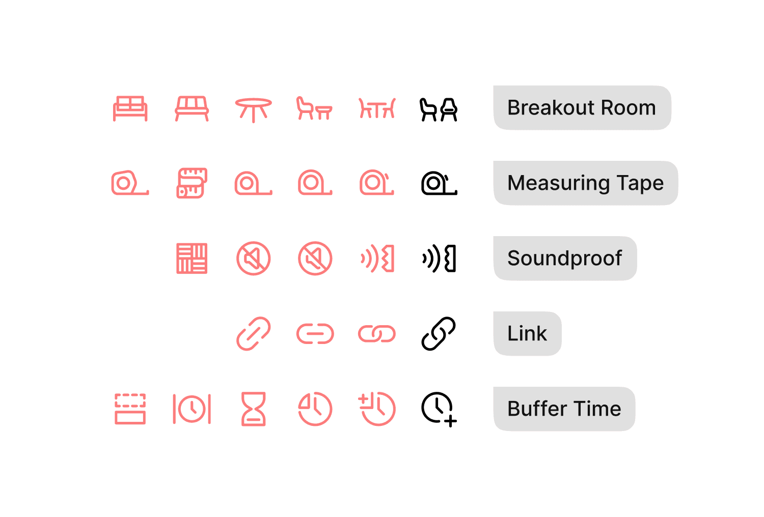
Even icons may need to go through a journey of self-discovery.
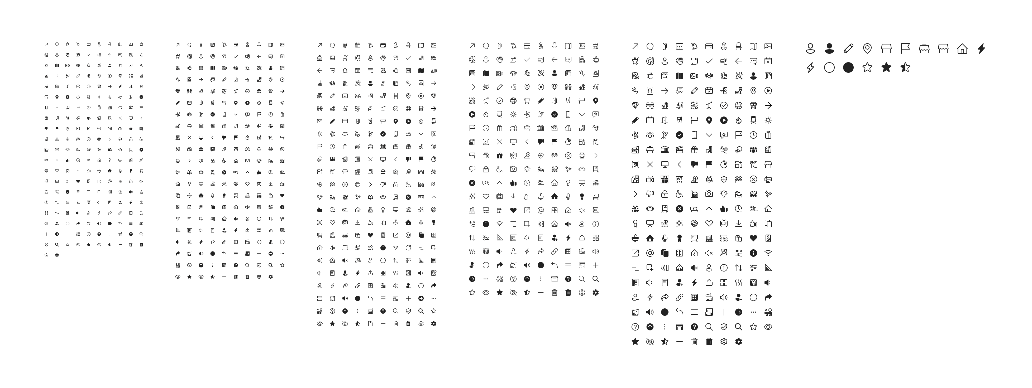
After I had conducted all the reviews and finalized every concept at 24px, I had a great starting place to build all the additional sizes. Before I progressed to that stage though, I took the opportunity to create any filled icons that Peerspace needed. Here are all the outlined and filled icons at the 24px size, summing up to 230 individual icons.
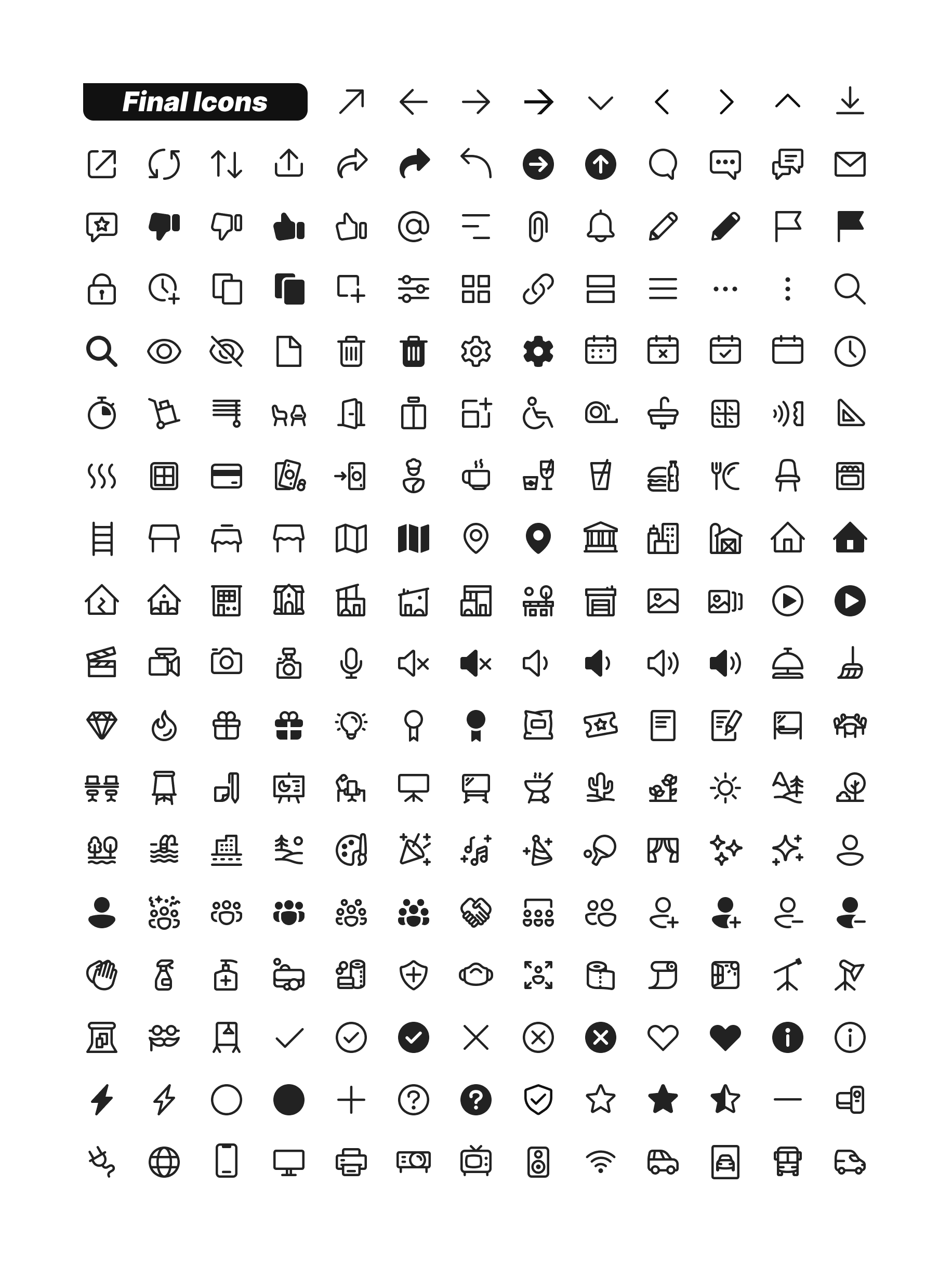
Like a tasty box of chocolates, it's satisfying to see every icon in a group like this, .
Build them big, shrink them small
After building all the 24s, it was time to create all the other sizes. These sizes included 16, 20, 24, 28, 32, and 48. I kept the complexity levels proportional between the sizes — meaning that the levels of detail were the same for all sizes. But in order for that to work, the stroke weights also needed to be about proportional too. Note how the stroke weights go from 1px, to 1.5px, to 2px, then finally 2.5px. These variations of stroke weight are necessary for the library to be both proportional and perfectly on-pixel.

Peerspace preferred proportional and pixel-perfect, a particularly pesky problem provided you aren't a pixel-pushing professional.
Not every icon concept was needed at every size. To save costs on the part of Peerspace, I only created the sizes that were needed. That's why you there are some gaps in the icon library below. Altogether, I built a total of 1052 unique icons.
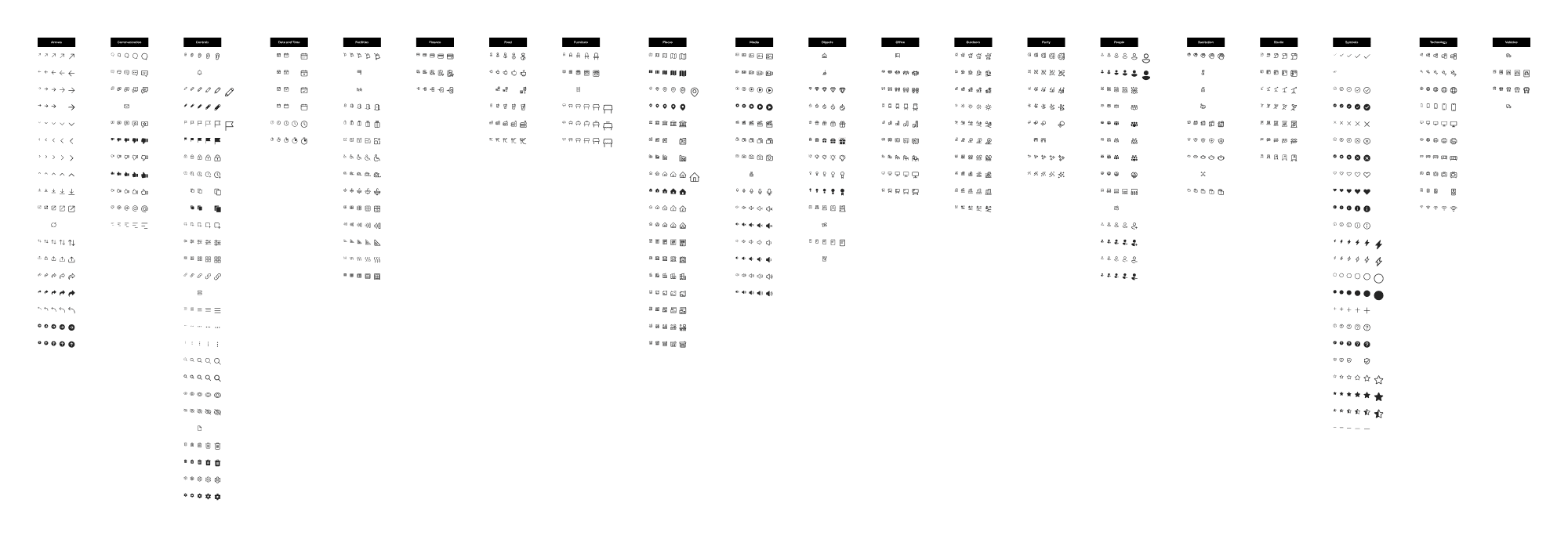
Beautiful and within budget!
Exporting icon components with variants
One of the great things about Peerspace's icon library was that their icon components utilized variant properties, like size and fill type. This functionality is fantastic for product designers. Component variants make it easy to swap variations to test in designs. But the downside is that if you were to export those variants, the resulting file names are incorrect. As of now, there isn't a way to customize the export name of a component variant.
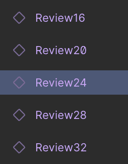
For example, the image below shows one of Peerspace's icon variants. If I had exported the selected icon as-is, it would display like this:
24, Regular.svg
But ultimately, the correct file name needed to look like this:
Review24.svg

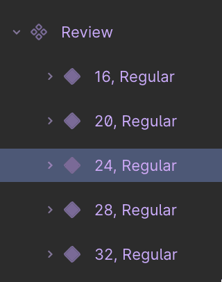
To solve this, I copied the icon variants to a separate section (creating linked instances), and renamed the instances to the correct file names. Then I exported the renamed instances. This way, any edits to the vectors on the original would still carry through. This simple workaround was a reliable way to export icons with the correct file names, while keeping the value of their variant properties.


Now we could have our icon variants and export them too!
Conclusion
In 3 months, I created 1052 individual icon assets, ensuring they had a 1:1 replacement for every icon in their system. Even though many of these icons had an original concept in place, it was satisfying to tidy up their style guidelines and offer a nice refresh to their existing library.


Want to read more?
I like to write about icon design, so if you'd like to learn more about my craft and my process, check out my articles section. If you want to see more of my work, then click on one of my other case studies. If you're interested in working together, then contact me and we'll get started!