Twitter (now called "X" I suppose) is a social media platform that facilitates the global conversation. I was brought on by the design systems team to build emojis, respond to new icon requests, and facilitate the transfer of the icon library between two styles.
Services
Icon Design • Design Systems • Emojis • Style Exploration • Photoshop Automation
Team
Keith Miller, Jason Sofonia, Joey Banks, Magdalena Long, the Iconists
Dates
November 2021 to August 2022 (9 months)
Website
TLDR;
In 10 months, I managed and organized two UI icon libraries simultaneously, built the style for a brand icon library, and illustrated 66 emojis and 66 UI icons.
Why they brought me on
Twitter’s Design Systems team needed an iconographer to take on new requests coming through the pipeline, and to create icons in both the old and new styles as the new style was being developed by another group of icon designers, the Iconists. Originally, the role had been managed by senior designers, but there was a need for an icon specialist to fill in the role.
I designed 66 unique concepts of product icons while I was at Twitter, often designing them in two different styles. Below are examples where I created data and analysis icons following two different sets of rules.
My responsibilities quickly expanded though as I was more than qualified to handle the load. In my downtime, I designed emojis and created a brand new presentation icon style.


We have two styles, “slightly bubbly” and “slightly less bubbly”
The "Privacy Settings" icons
Some the product icons I created went through rigorous user testing. The privacy and security team wanted to write a white paper to test the performance of privacy settings icons across the globe, potentially setting the standard across the industry. I created a variety of options for each concept, and the team tested them in the US, UK, and Japan, with a 1000 person sample size each. My contract ended before I could learn which icon performed best, but it was satisfying to see my icons used in such a large study.

And I mean… who knows more about privacy and security than social media companies?
Designing some delicious emojis
Twitter needed new emojis for the 14.0 unicode emoji releases that matched their iconic flat style. I illustrated 66 unique emoji illustrations in 4 days when my team expected they’d take me a month. I wanted to work on them promptly so we could implement our emojis before any of the other platforms did, essentially racing to make our depiction of the concept “canon” in the industry.
Some of the icons included in this set were quite complicated and detailed, such as the jellyfish, x-ray, and nest emojis. It was a pleasure to build such beautiful, colorful icons, and I hope I get to do a similar project again.

Some of these are just so fun, like that goose! Or the peas!
I only serve the finest chunky icons
Cooking up a brand icon set from scratch
One of the first things I noticed at Twitter was that they didn’t have a good set of general purpose icons for internal presentations or marketing needs. When I wasn’t working on my high priority work items, like product icon requests or emojis, I worked on this project.
The requirements were simple… the set needed to work on bright, colorful, textured backgrounds (which were common at Twitter), and also needed to represent complex abstract concepts. I tested out a variety of styles that reflected Twitter’s brand to give my colleagues some options to run with, and also tackled the most difficult concepts first to see if the styles would hold up. Some of those included ideas like “misinformation”, “religion”, “lgbtq”, and “justice”.
We settled on style number 4, the most detailed style, which held up at both large and small sizes. The driving principle behind the style was “chalkboard with drawn on chalk”. In essence, solid shapes with thin white lines drawn over them.


Photoshop template magic
One of my colleagues on Twitter Blue created custom app icons that changed each season. One issue they were running into was that the export process was tedious and time-consuming. I figured that with Photoshop's smart objects, advanced exporting features, and my macro knowledge, I could create a system to get new assets cranked out in no time.
I built a template that allowed me to drop in artwork into a smart object and extend it across all sizes for desktop, iOS, and Android. As soon as the artwork changed, it would register at every size, and Photoshop would automatically export the new assets. I also built a macro that copied the newly exported assets into their own folder, then rename the icons matching their platform’s unique naming syntax.
In 5 minutes, I could export, name, and organize a dozen app icons—about 250 individual assets— cutting down final export production time exponentially.
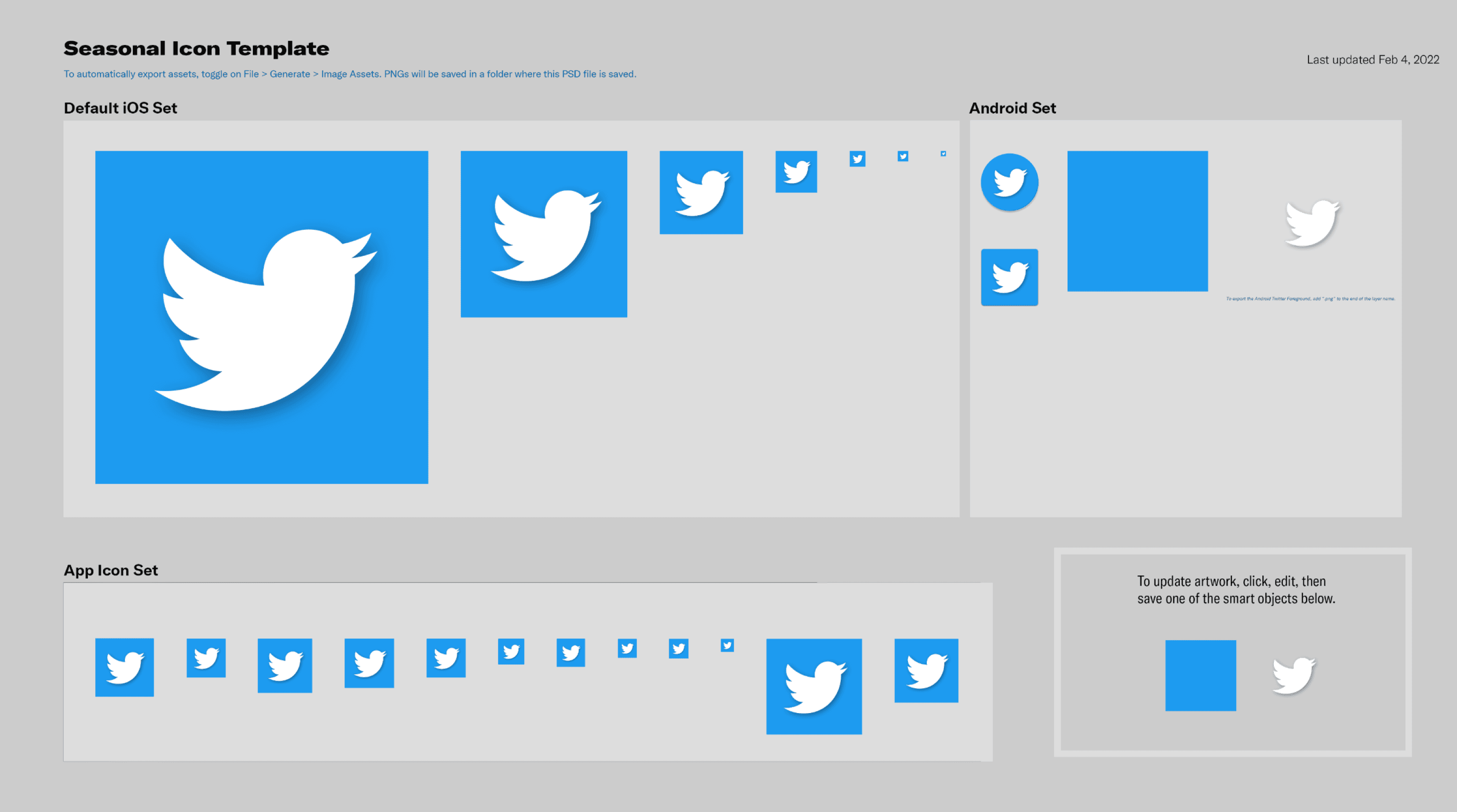
It may not look like much, but swap out that blue square and BOOM, Bob’s your uncle
Conclusion
In 10 months, I managed and organized two UI icon libraries simultaneously, built the style for a brand icon library, and illustrated 66 emojis and 66 UI icons.
While I didn’t make as many icons at Twitter as I did at many of the other companies I worked with, I had a large diversity of projects. If you need a designer capable of working in many different styles, let me know! I’d be happy to jump between styles and build them up efficiently
Want to read more?
I like to write about icon design, so if you'd like to learn more about my craft and my process, check out my articles section. If you want to see more of my work, then click on one of my other case studies. If you're interested in working together, then contact me and we'll get started!